soulful
Designing a fresh new web presence for contemporary artist Jennifer Perlmutter was an unexpectedly soul-engaging experience.
We were introduced as she was closing her highly successful gallery in Lafayette, California, where she showcased the work of multiple artists in addition to her own. With a consolidation into one gallery in Carmel-by-the-Sea, the focus has shifted more fully to Jennifer’s work.
While not technically a rebrand, the project invited us to present Jennifer differently, to center attention on the artist, her process and her gallery.

something old, something new
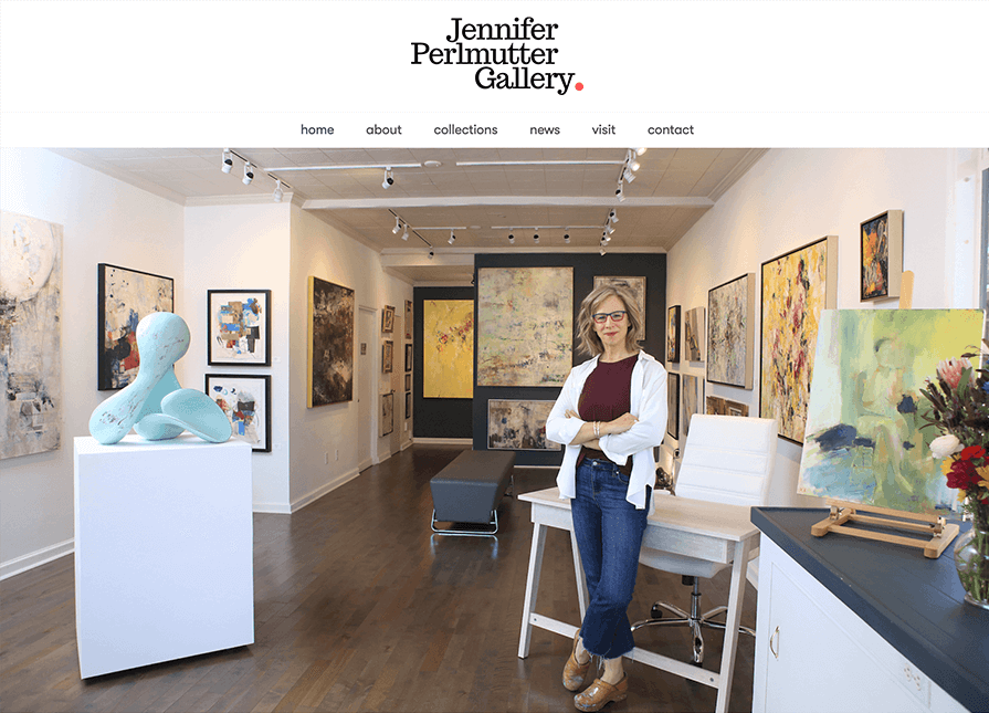
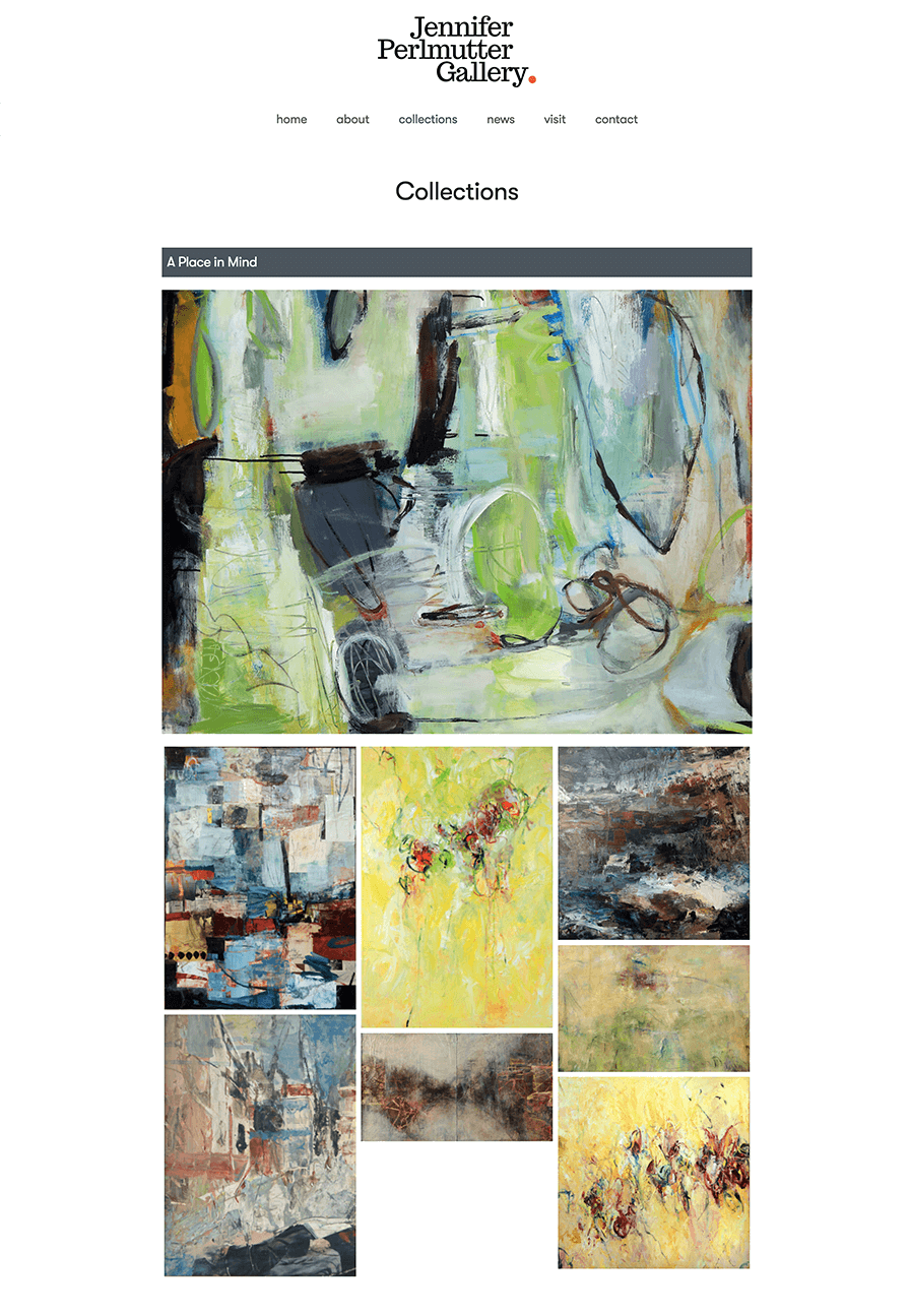
In its previous incarnation, Jennifer’s website featured chic branding with a stand-out logo we had no interest in changing. Our approach was to elevate the brand with an experiential website reminiscent of the gallery itself: Expansive white walls, ocean-gray accents and art everywhere. The intent is to provide a sister experience to being inside the gallery before, after or in place of a visit.
To complement the brand refresh, Jennifer hired local photographer Randy Tunnell, who helped her tell her story visually. To maintain brand consistency, we adopted the same fonts for the website that Jennifer uses in her print collateral and ads.
process and result
The project was particularly intriguing because throughout the design and development of the new site, we discovered over and over the similarities in our creative process, life experience and business approach…and the transformative power of a professional pivot.
We launched Jennifer’s new website in conjunction with the grand opening of her Carmel gallery in June.
Jennifer’s talent, aesthetic, her unique perspective and attention to detail shine through.


![]()
~ Jennifer Perlmutter


