next-level IR
Handling investor and public relations for publicly held companies is an exacting profession. Given that it’s a traditional field most IR firms have a less-than-contemporary brand image. Not so with CORE IR.
We first connected with co-founder and president Scott Gordon several years ago while working with a mutual client. When it came time for CORE IR’s web redesign, he got in touch to share his ideas and vision.
The project was exceptional in that an establish investor relations firm wanted a contemporary, stand-out design and showed up as a collaborative partner to make it happen. The client invited us to unleash our creativity and loved what we came up with.
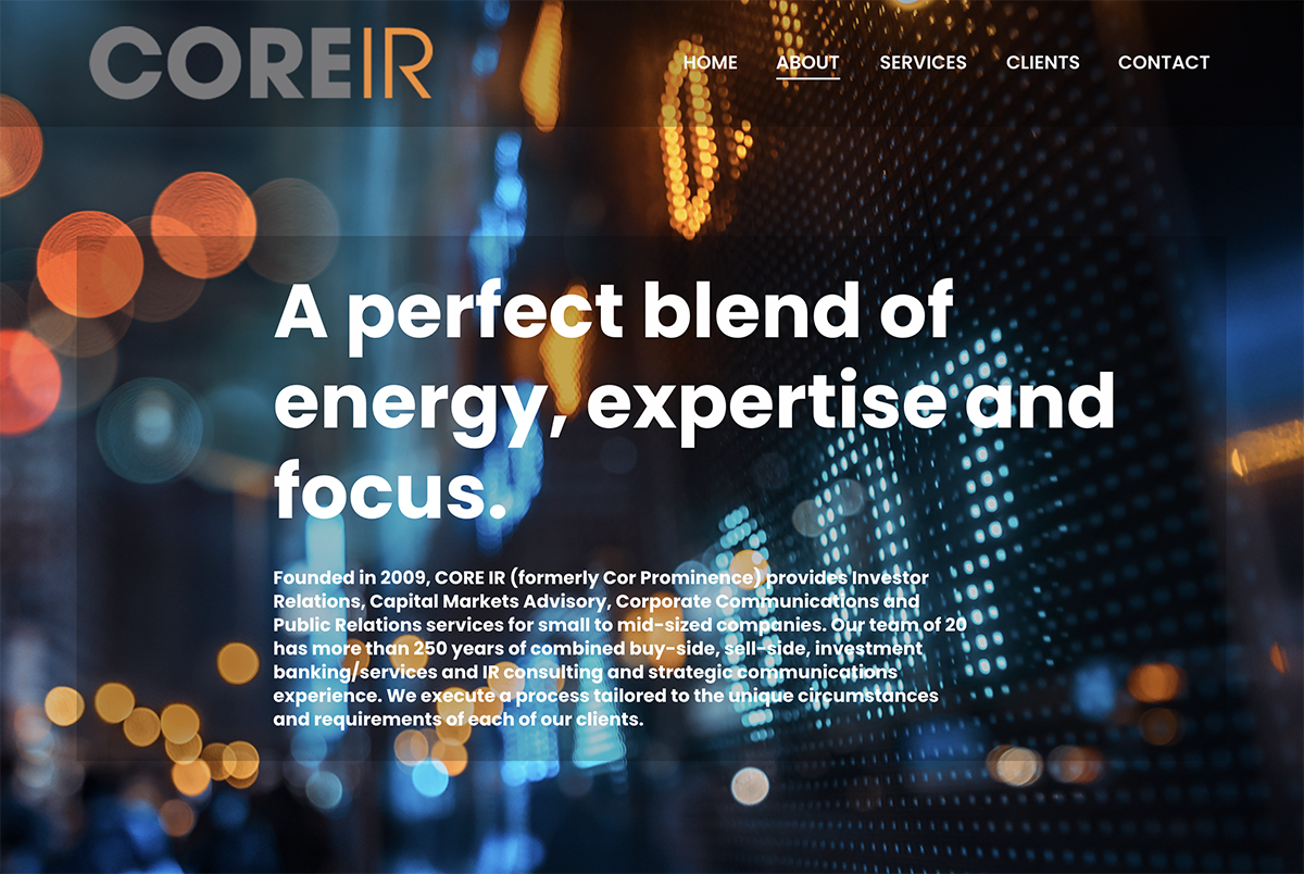
big and bold
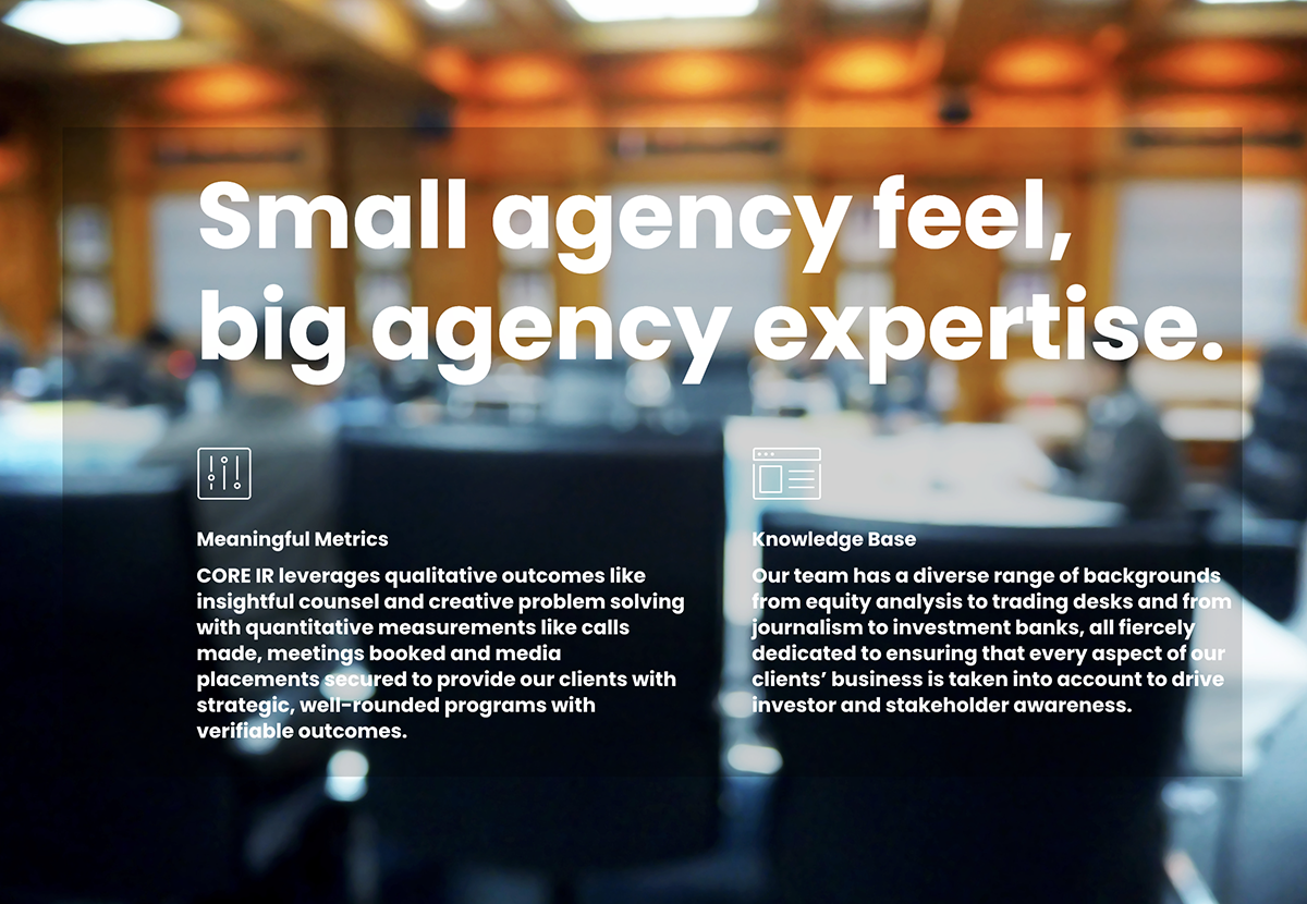
Our specialty is helping our clients get noticed and tell their story so they attract the right customers and build business. We like big and bold design to accomplish this.
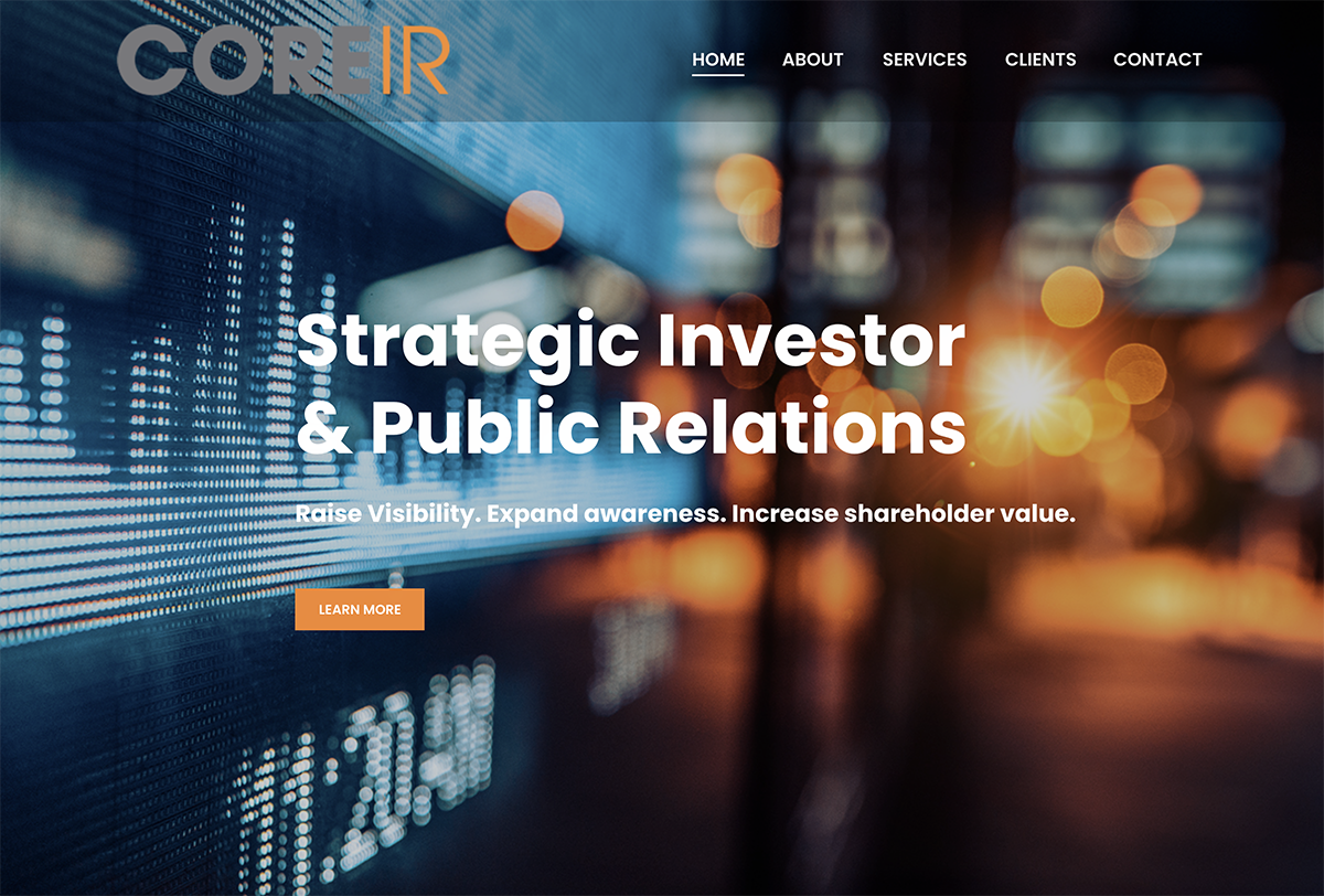
The company had already invested in an established logo and wanted to keep it rather than rebrand. Scott and his team were considering a variety of new color palettes but we came up with a design solution that allowed the firm to keep the existing logo as is. We expanded the brand palette based on contemporary stock market imagery that blends with the existing gray/orange color scheme. The result is vibrant, contemporary, artistic yet professional brand image that takes CORE IR’s web presence to the next level.
messaging transformation
For CORE IR and other clients, a redesign process is transformational for their business and branding because razor-sharp focus on messaging and image is required. With strong brand marketing as well as design experience, we ask the right questions and love participating in the metamorphosis!
Like all of our websites, coreir.com is mobile-responsive and SEO-friendly, built on the versatile WordPress platform.
~ Scott Gordon, CORE IR
